KAJI
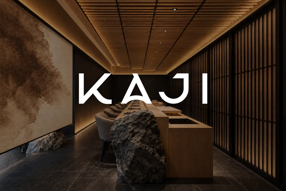
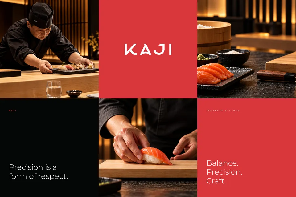
Balance. Precision. Craft.
Project background
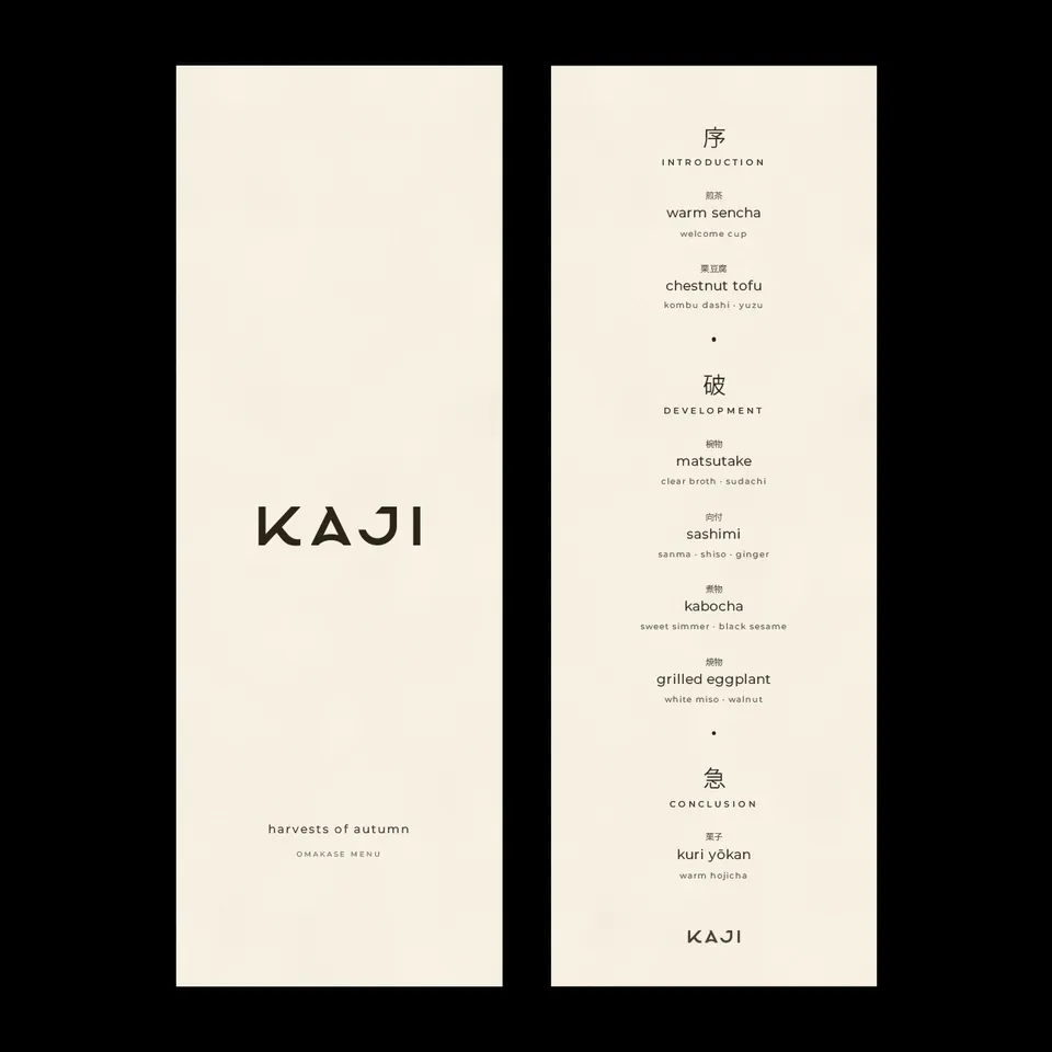
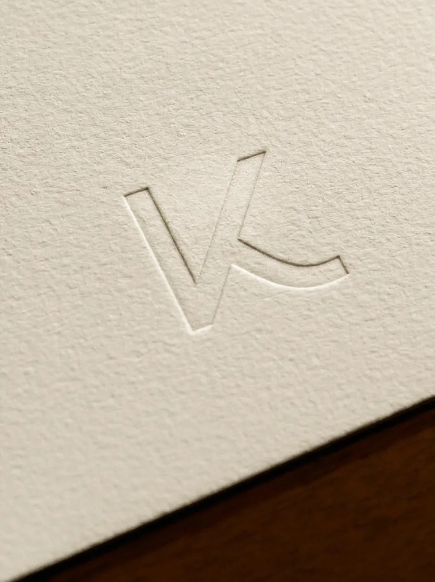
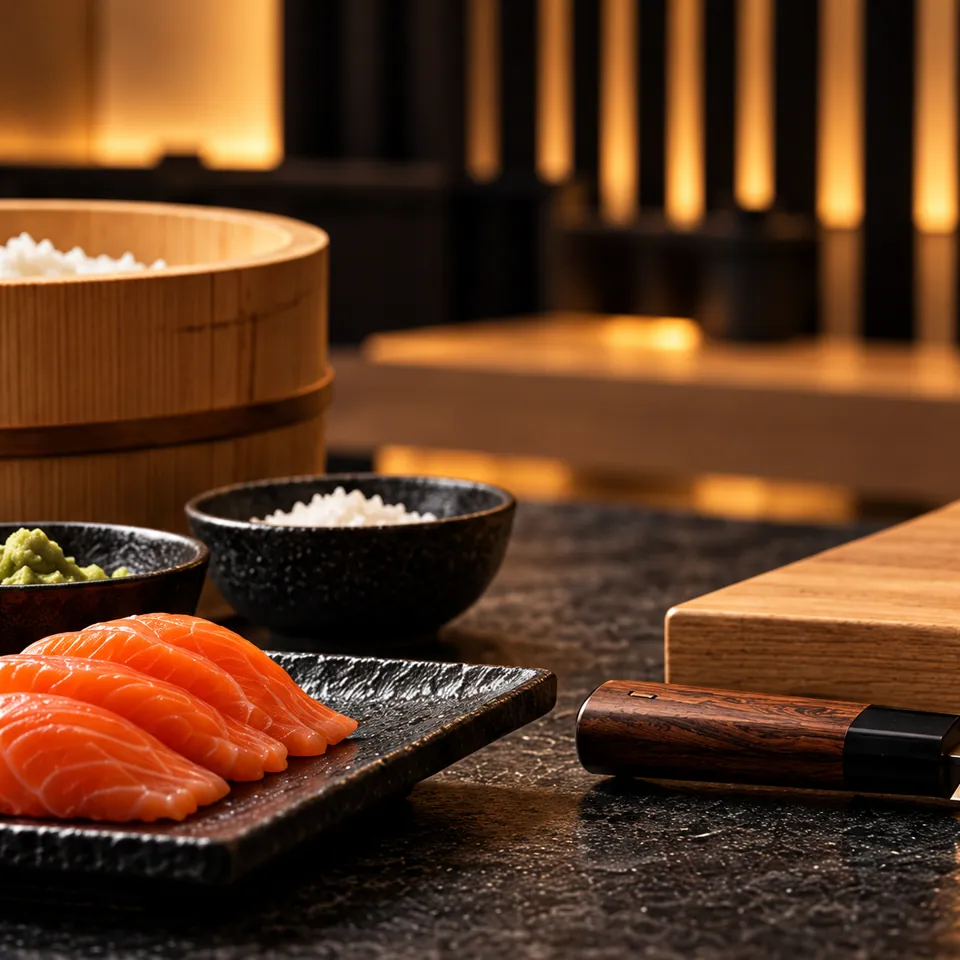
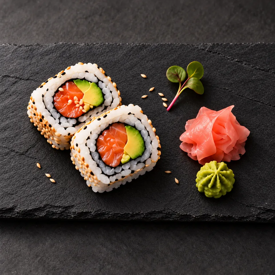
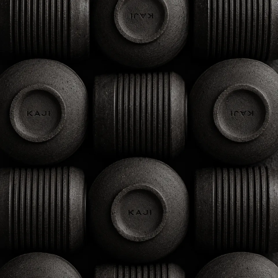
A contemporary Japanese kitchen in Manchester. A geometric monogram, a monoline logotype and one disciplined red, carried through menus, tableware, signage and print.
Services
- Logo & symbol
- Identity system
- Print & signage
- Menus
Client
- KAJI
- Manchester, UK
The Brief
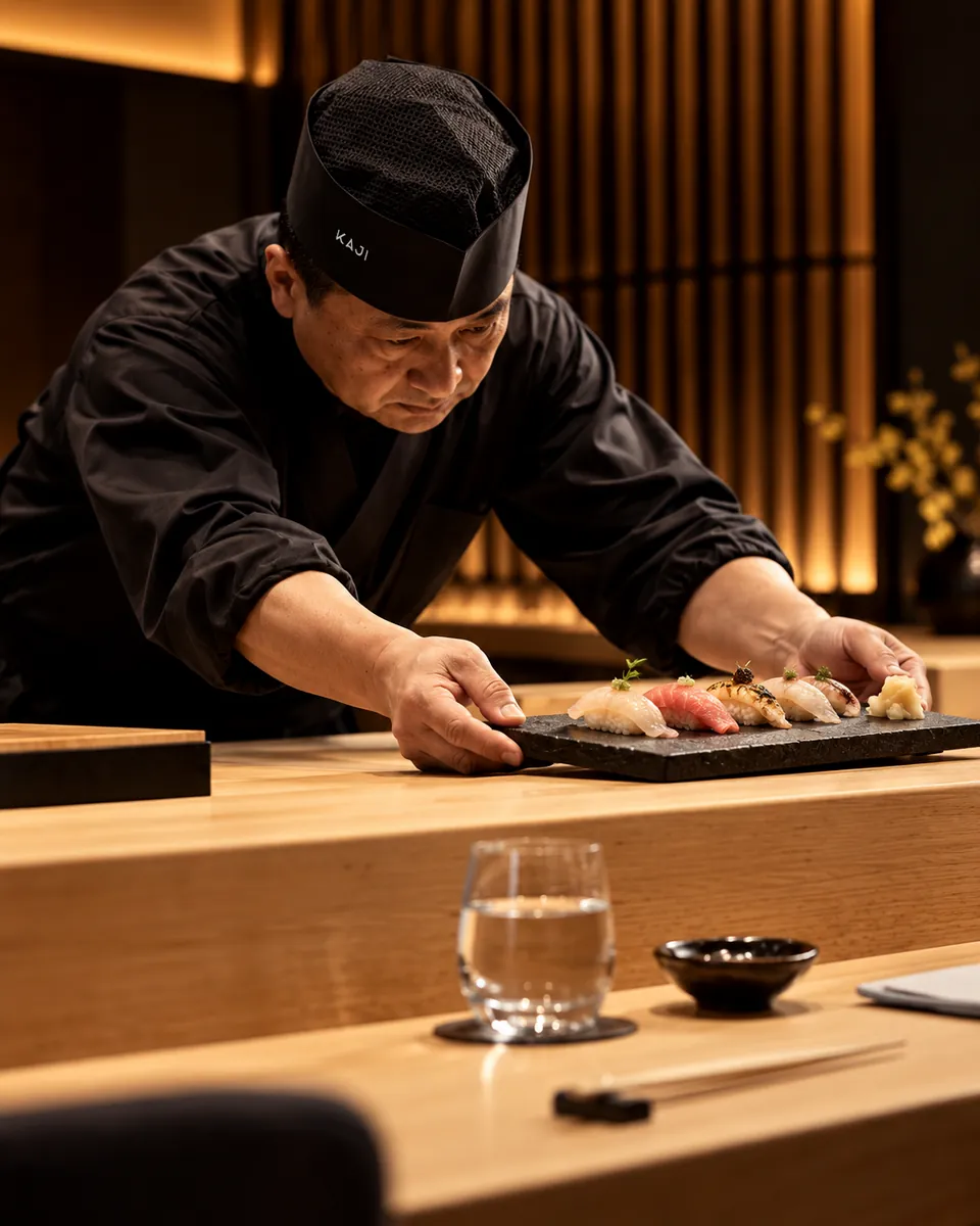
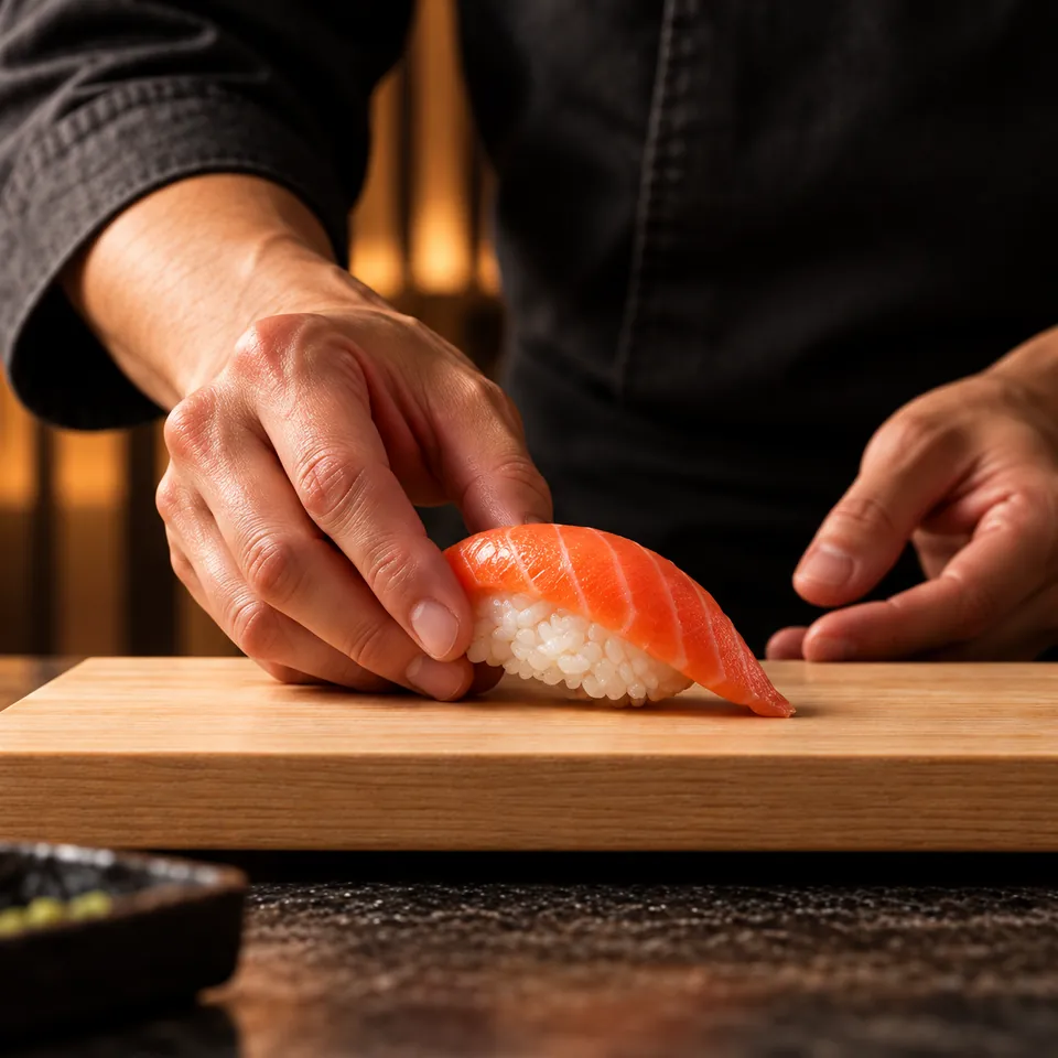
Manchester has no shortage of sushi. KAJI wanted to stand apart without shouting: no lanterns, no brush-stroke clichés, nothing that looks like a theme restaurant.
The Idea
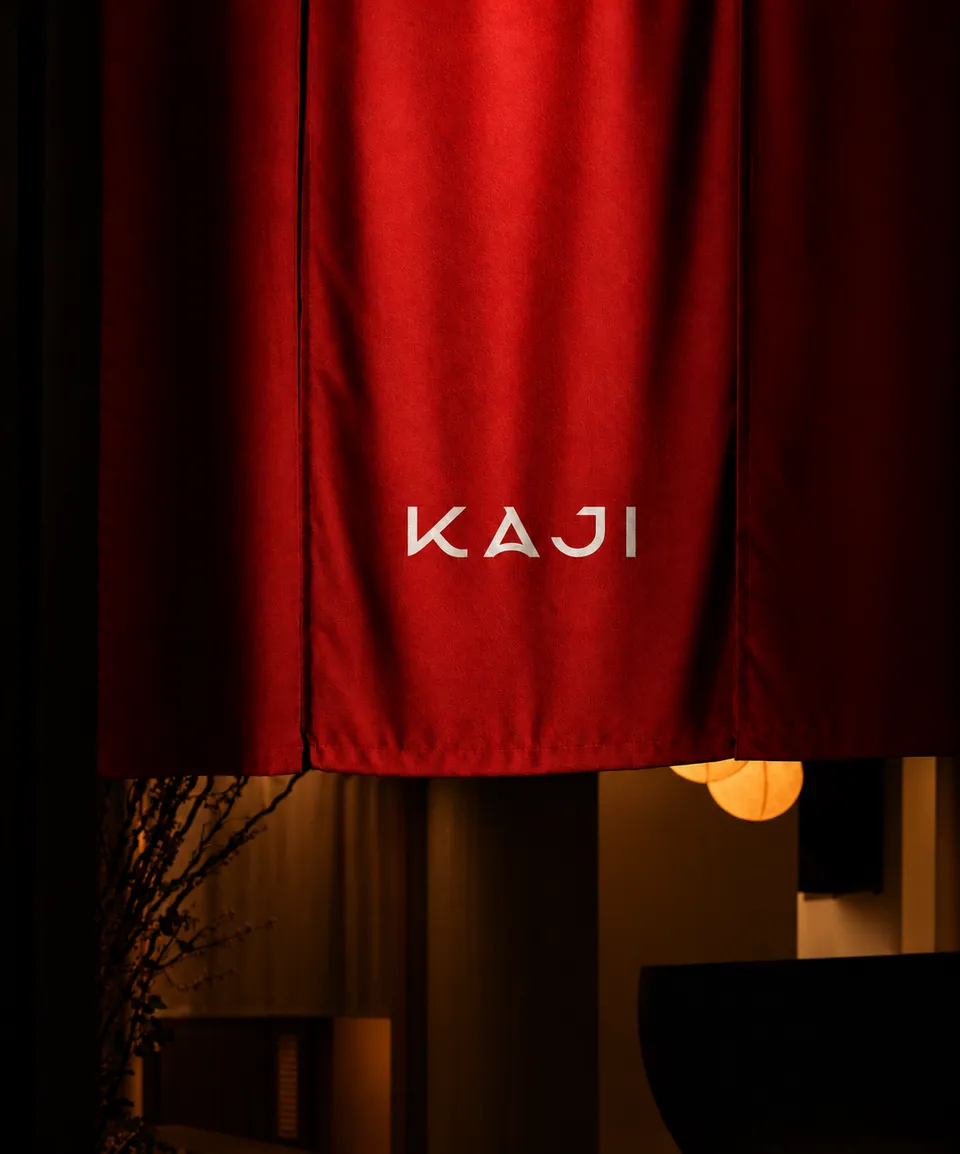
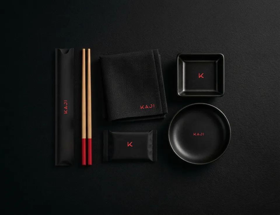
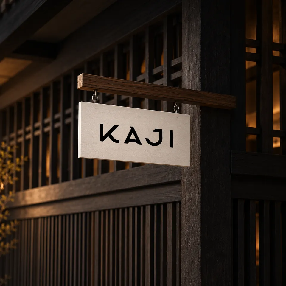
Sumi black and rice carry everything. Red appears once on every piece: the tips of the chopsticks, the K on the napkin, the word on the door.
Have a brand in mind?
Tell us about it in a short brief. We read every one and reply with first thoughts and a clear next step.
Start a projectOver 1,000 more projects on Behance