Chik Burger
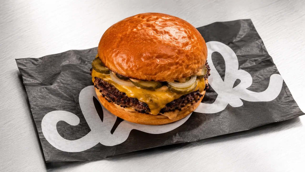
Manchester’s new burger, kept chik
Project background
Manchester gave the world its music, its football and its swagger. Chik is here to add the burger. A fast-casual spot built around one idea: good food should come with good vibes.
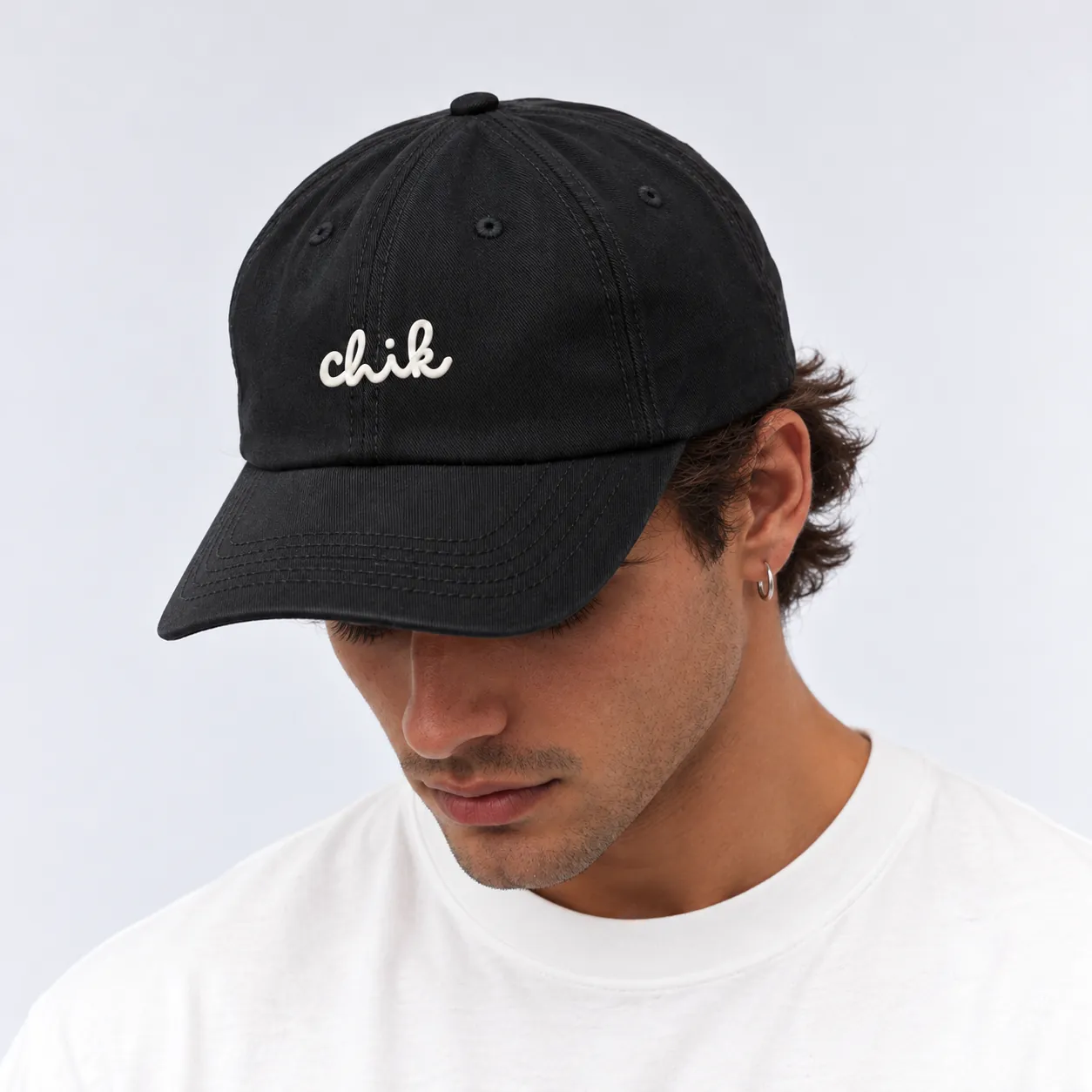
The brand needed to feel as confident as the city it calls home, and just as friendly: at ease on a burger wrap, on a cap worn across town, or on a restaurant wall.
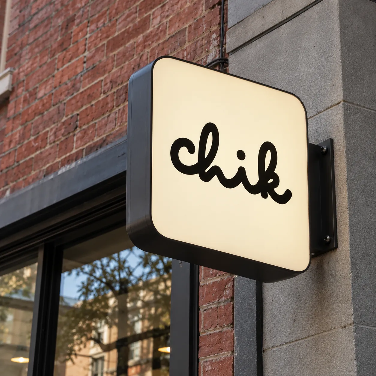
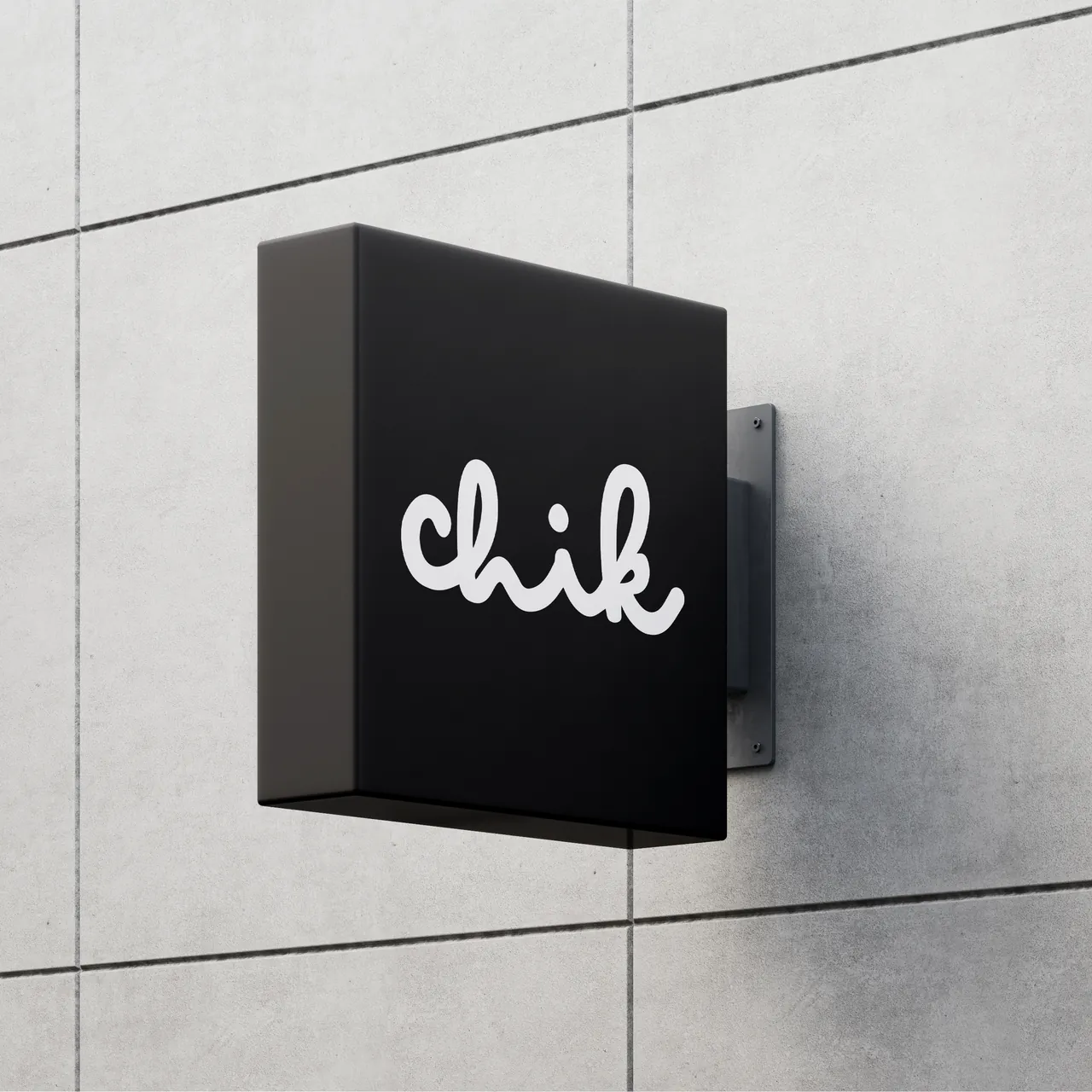
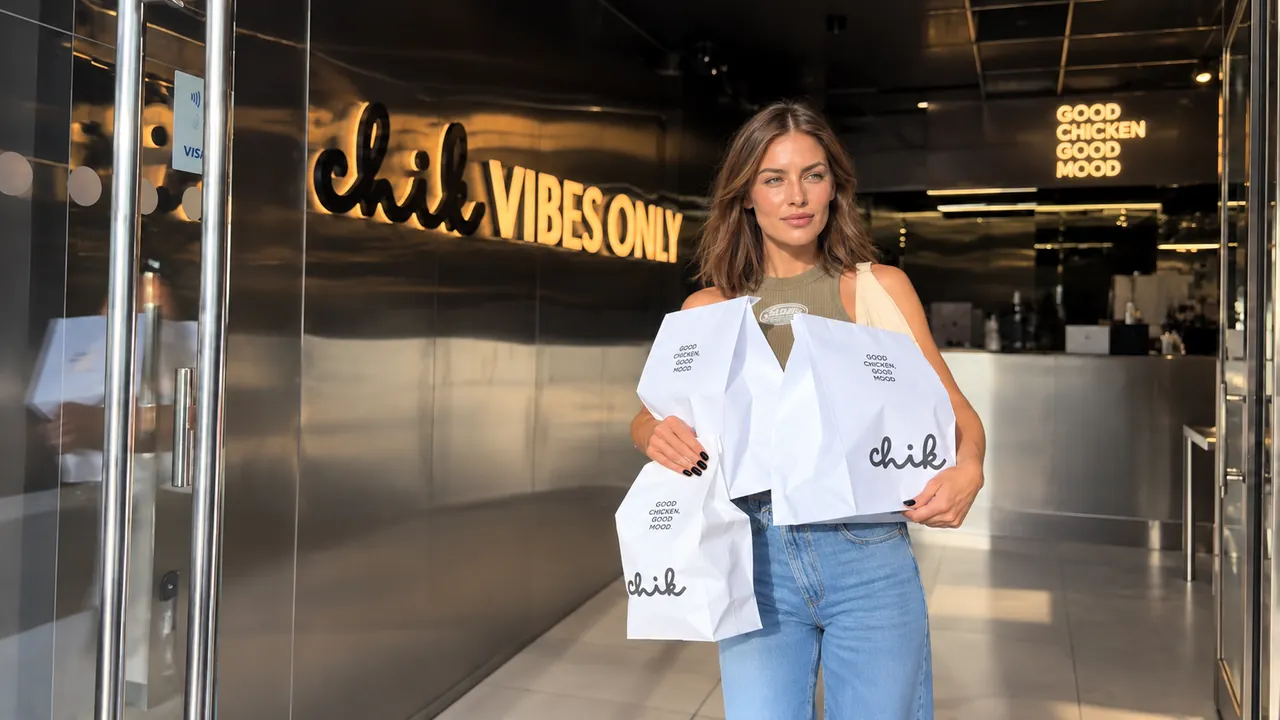
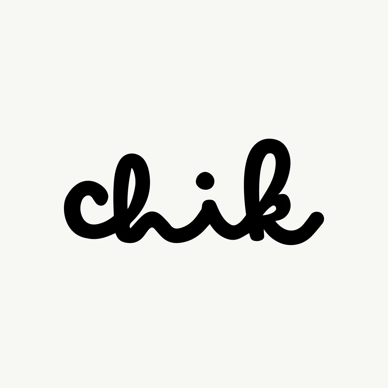
BRAVA created the identity from the ground up: a hand-drawn script logo, a cast of illustrated characters, a black and cream palette, and a family of packaging, signage, merchandise and interior applications that carry the same easy attitude.
Services
- Logo design
- Brand identity
- Illustration
- Packaging design
- Signage & interior graphics
- Merchandise
Client
- Chik Burger
- Manchester, UK
The Brief
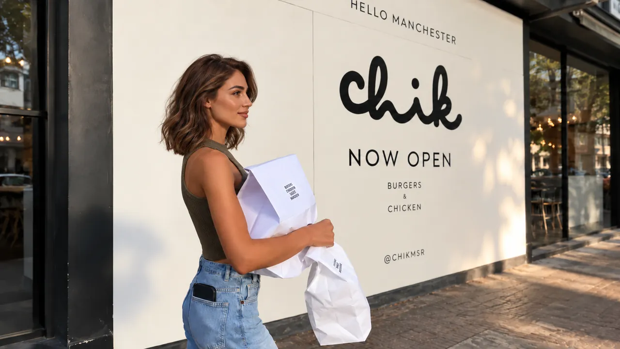
Chik wanted an identity Mancunians would happily wear, not only eat from. It had to work at burger scale and at city scale: legible on a wrap, loud on a two-metre wall, relaxed on a cap on a rainy Saturday in the Northern Quarter.
The brief asked for warmth without cliché. No fast-food red, no shouting. Something closer to a neighbourhood place with taste, where the food is serious and the mood is not.
The Concept
Keep it chik. The script logo reads like a signature scribbled on a napkin: quick, warm and a little cheeky.
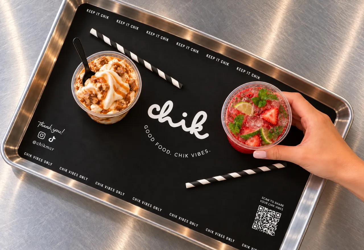
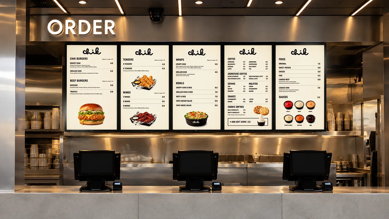
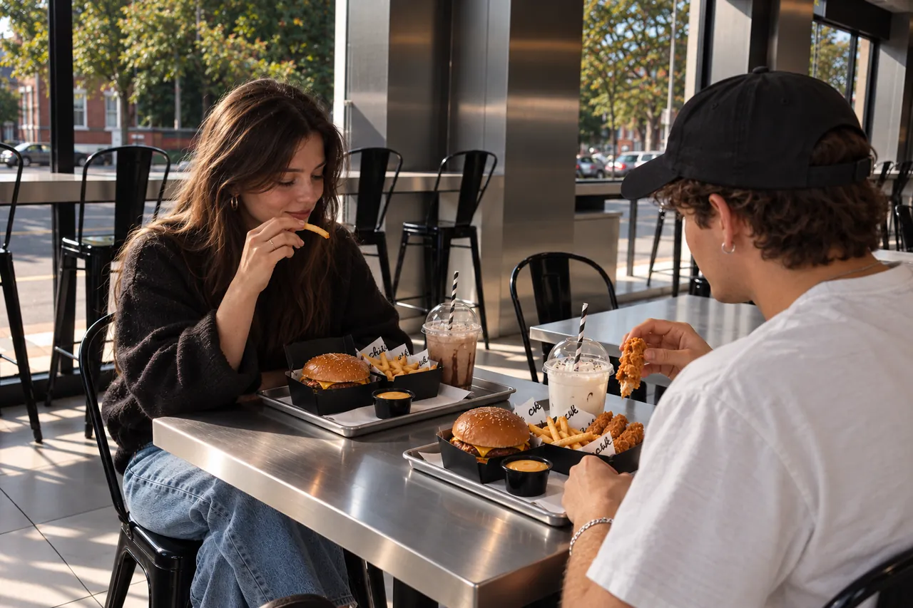
Around it everything stays calm. Brushed steel, black paper and cream type leave room for the food and the mark to do the talking.
Brand Identity
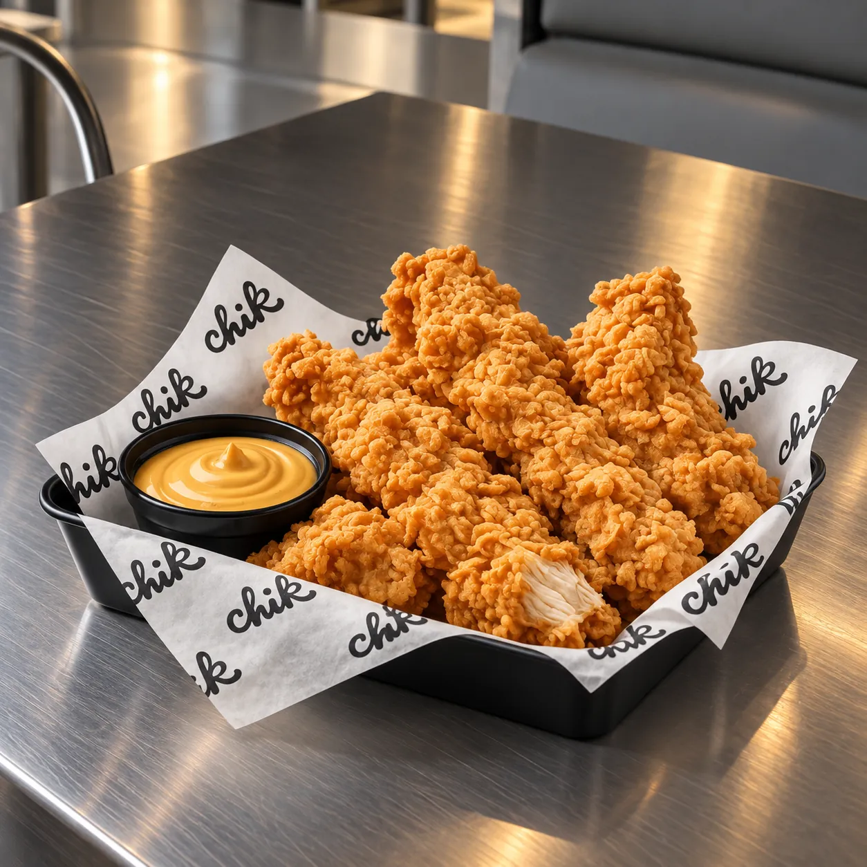
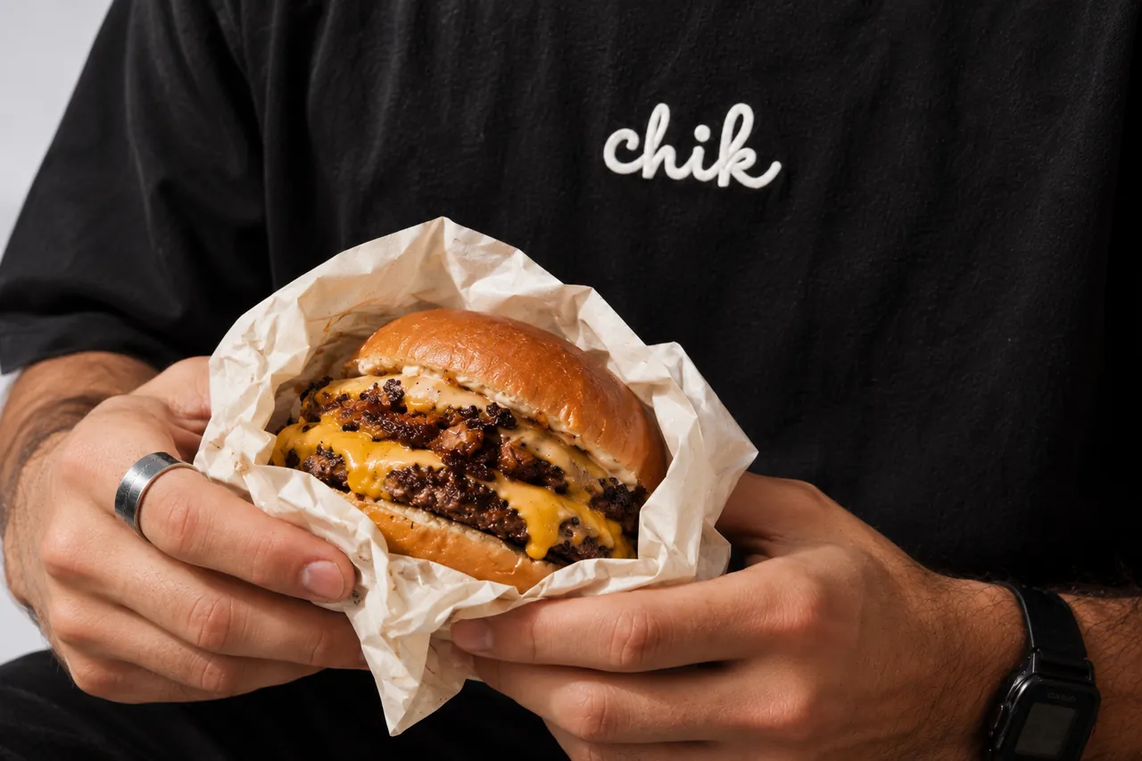
One mark, two colours. The wordmark works light on black and black on cream, and holds up embroidered, printed on greaseproof paper, lit on a wall or hung above the street.
Short lines like Good food. Chik vibes. and Chik vibes only give the brand a voice on trays, walls and social, so every touchpoint sounds like the same place.
Illustration
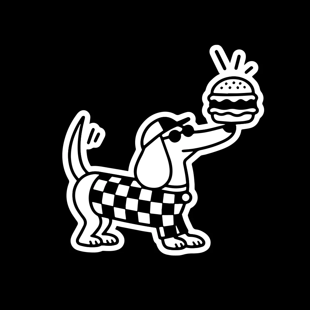
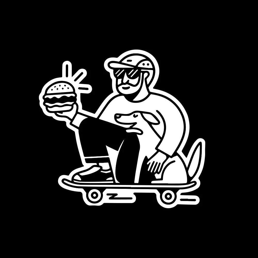
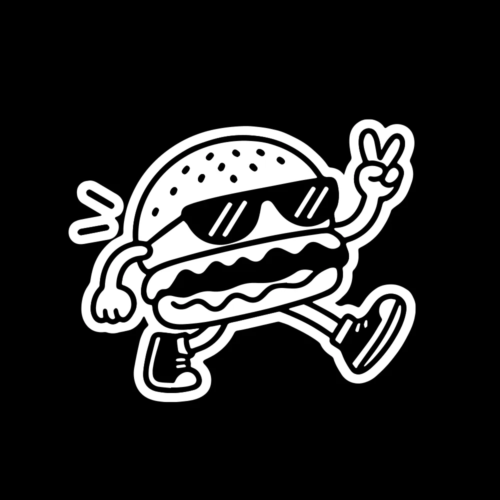
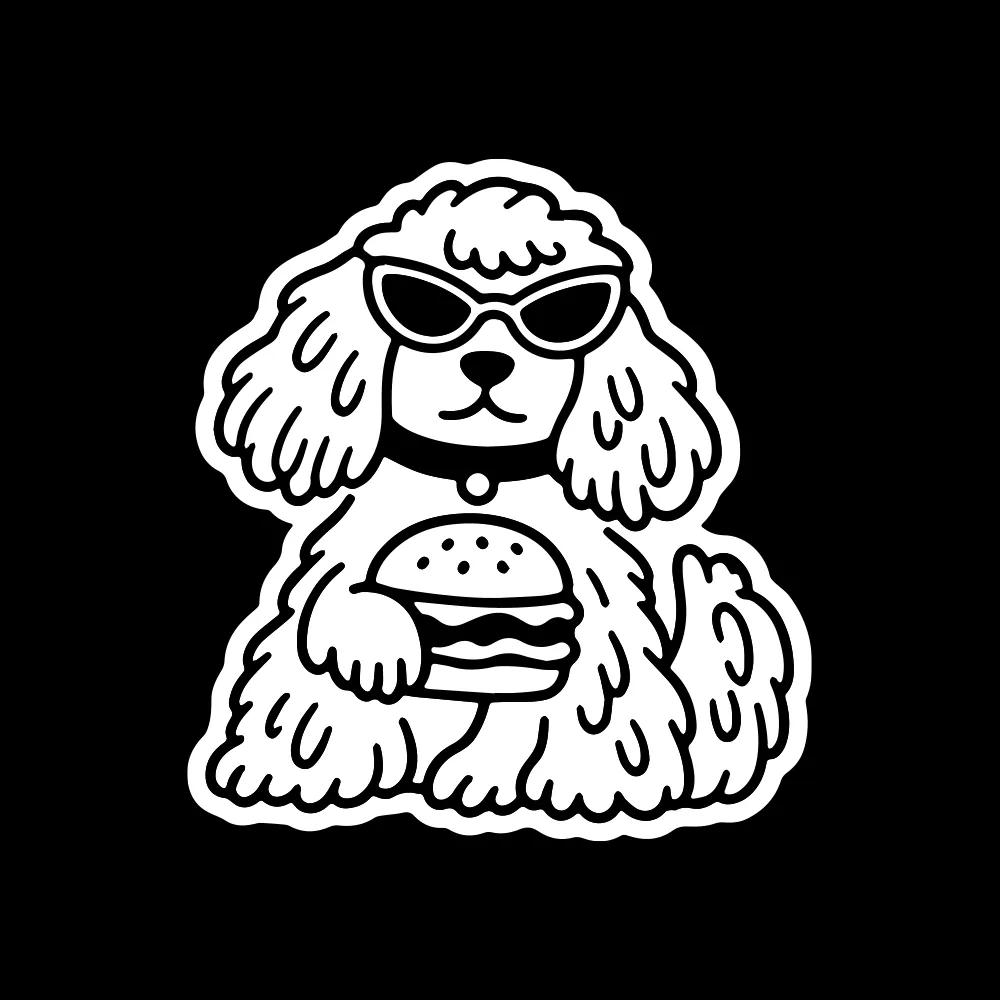
A small cast of characters lives alongside the logo: a dachshund on a delivery run, a skater on his lunch break, a burger with attitude.
They are drawn in the same thick, friendly line as the script, so stickers, menus, packaging and social feel like one hand made them all, and give people something to collect.
Colour
A restrained palette keeps Chik confident. Deep black and warm cream carry the identity; brushed steel comes from the space itself.
Cheddar is the only accent, borrowed straight from the burger, and used sparingly so it always feels like a treat.
Good food. Chik vibes.
More work in the archive
Hundreds of identities, logos and packaging projects from the last 13 years, collected on Behance.
See the full portfolio on Behance