BurnTec Fire

Fire protection, without the fire
Project background
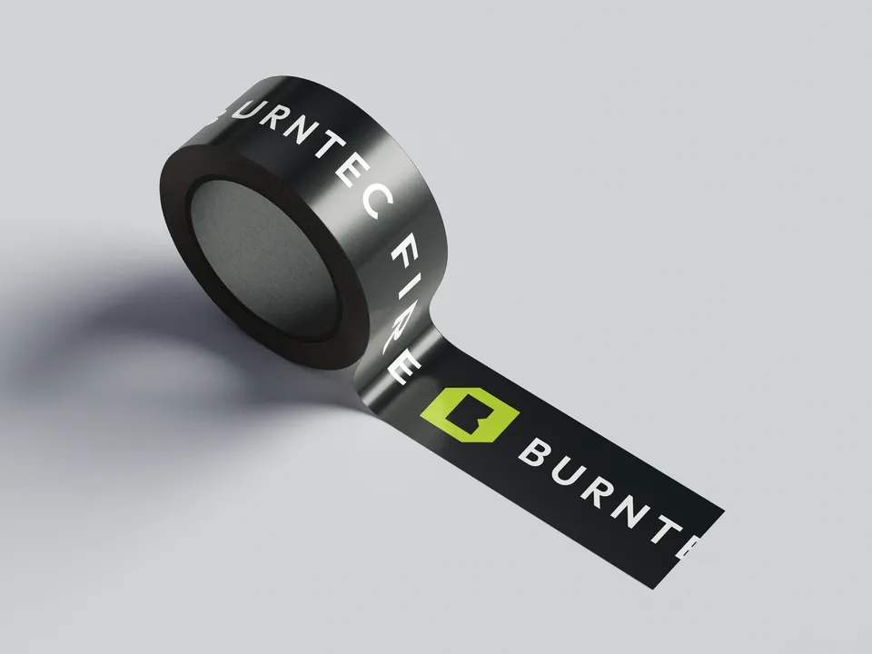
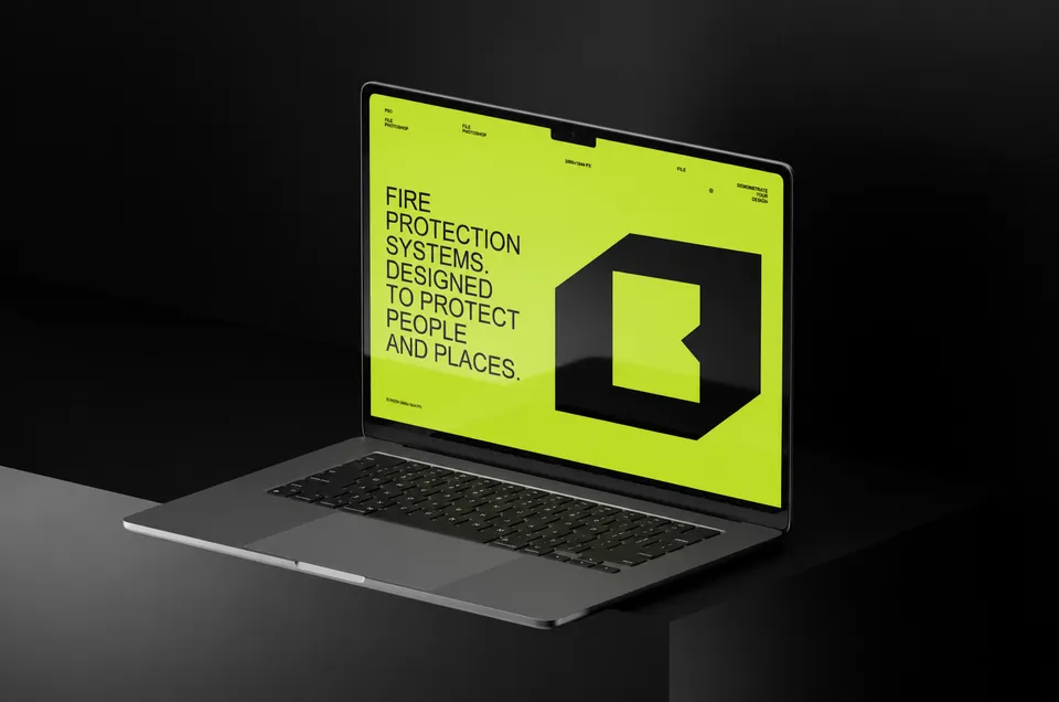
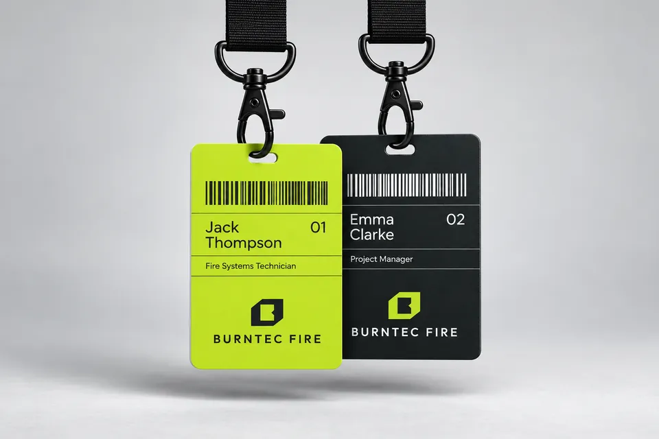
Fire protection for Australia's leading builders and developers. Strategy, a new mark, a type, colour and grid system and a 29-page brand book, from uniforms and vehicles to the website.
Services
- Brand strategy
- Logo design
- Brand identity
- Brand guidelines
Client
- BurnTec Fire
- Australia


The Brief
Never visually communicate fire. Communicate protection. No flames, red gradients, shields or stock firefighters.
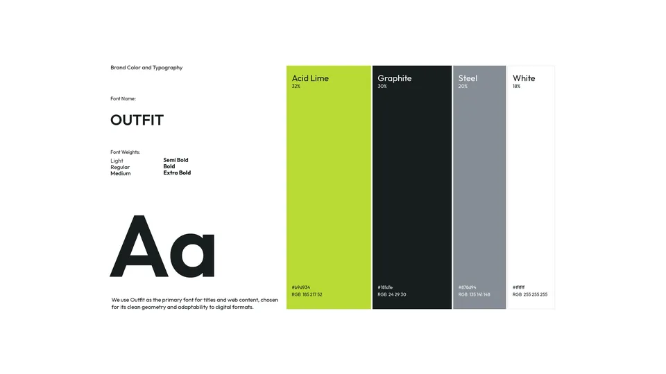
The Idea
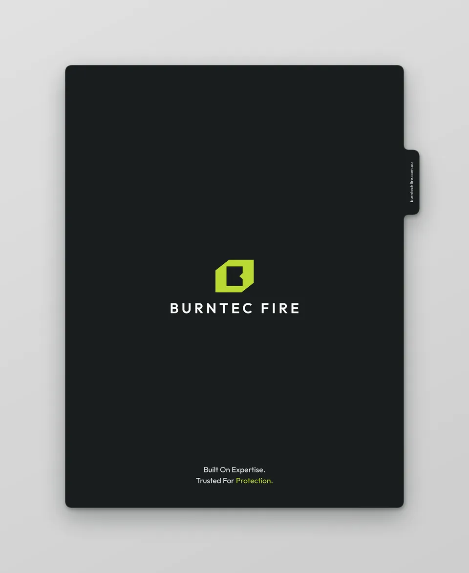
An architectural language instead: concrete, steel, grids and linework. The symbol is a geometric B drawn as the plan of a protected zone inside a building.
Have a brand in mind?
Tell us about it in a short brief. We read every one and reply with first thoughts and a clear next step.
Start a projectOver 1,000 more projects on Behance